
10 Best Google Sheets Budget Templates for 2026

Updated:
June 21, 2026
Updated June 2026
The best Google Sheets budget template depends on how you budget. Use a monthly template for regular household planning, a weekly or bi-weekly template for variable income, a zero-based template if every dollar needs a job, a 50/30/20 template for simple category planning, and a business budget template for revenue, expenses, and cash-flow tracking.
There is no single best template for everyone, so this guide compares free Google Sheets budget templates by use case, complexity, cadence, and features. Use the table below to pick a template quickly, then open the copy or download link for the sheet that fits your budget style.
Quick comparison: best Google Sheets budget templates by use case
Smartsheet’s current Google Sheets budget library includes several of these formats, including monthly, weekly, bi-weekly, household, zero-based, 50/30/20, college, and business templates.
1. Monthly budget template
Best for: Regular household or personal budgeting.
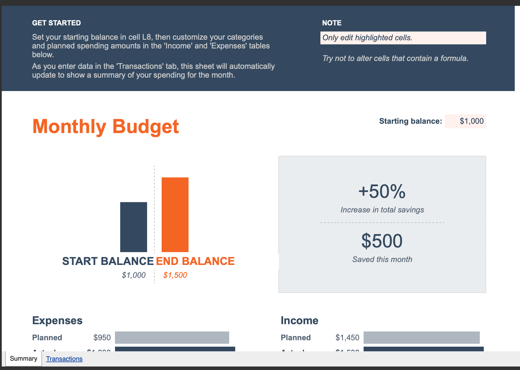
What it tracks: Monthly income, savings goals, recurring expenses, variable expenses, and potential savings.
Why it works: A monthly budget template is the best starting point for most people because rent, mortgage payments, utilities, subscriptions, insurance, and many paychecks already follow a monthly rhythm. Tiller describes Google Sheets’ native monthly budget template as a simple income and expense tracker with a dashboard that can be customized by category.
Limitations: It can be too basic if you want transaction-level tracking, debt payoff planning, shared approval workflows, or automatic bank imports.
Get the template: Copy the monthly budget template
2. Annual budget template
Best for: Long-term planning, annual savings goals, and year-over-year spending reviews.
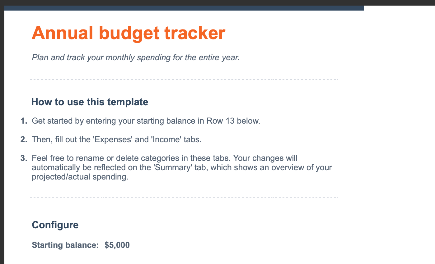
What it tracks: Monthly totals across a full year, income categories, expense categories, and annual summaries.
Why it works: Use an annual budget template when you want a high-level view of your finances instead of only looking month by month. Tiller notes that Google Sheets’ native annual budget template is designed for a simple yearly overview and works well alongside a monthly budget template.
Limitations: This is usually not the best sheet for daily spending. You may need to copy monthly totals from another tracker or add a transaction sheet if you want more detail.
Get the template: Open the annual budget template
3. Weekly budget template
Best for: Weekly spending control, hourly income, freelance income, and people who feel monthly budgets are too broad.
What it tracks: Weekly income, savings, expenses, category totals, and short-term cash flow.
Why it works: Weekly budgeting makes spending more visible. It is useful when grocery, gas, dining, or variable expenses can change quickly. Smartsheet describes its weekly Google Sheets budget template as a fit for users with variable pay schedules, hourly wages, and freelance income, with weekly tracking across income, savings, and expenses.
Limitations: Weekly sheets can feel repetitive if most of your bills are monthly. You may need a separate annual sheet for bigger-picture planning.
Get the template: Copy the weekly budget template
4. UI Bakery Google Sheets Budget Dashboard
Best for: Business teams that already manage budgets in Google Sheets but need a dashboard, approval flow, or internal finance app.
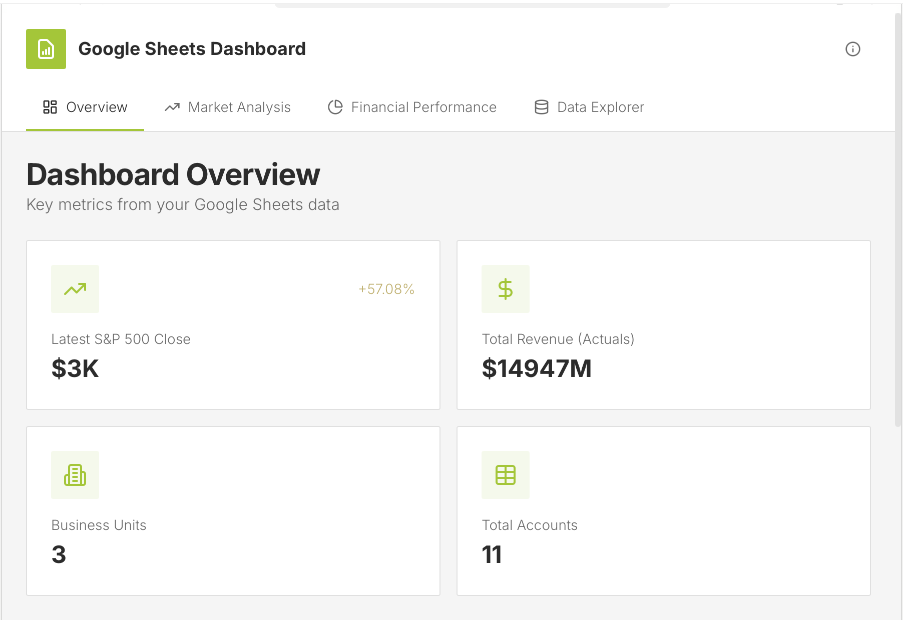
What it tracks: Budget vs actuals, forecasts, revenue, expenses, business units, account-level records, KPIs, and financial performance data.
Why it works: A regular Google Sheets budget template is useful for planning, but business budgeting often becomes a shared workflow. UI Bakery’s Google Sheets Dashboard template connects to Google Sheets data and lets teams build an internal dashboard with KPI cards, charts, filters, and tables. The template page specifically mentions financial performance analysis, actuals, budget, forecast, revenue, expenses, and internal tools for comparing budgets and forecasts.
Limitations: This is not a personal finance spreadsheet for someone who just wants to copy a simple monthly budget. It is better for teams that need to turn spreadsheet data into a controlled internal tool with a visual interface.
Get the template: Clone the UI Bakery Google Sheets Dashboard template.
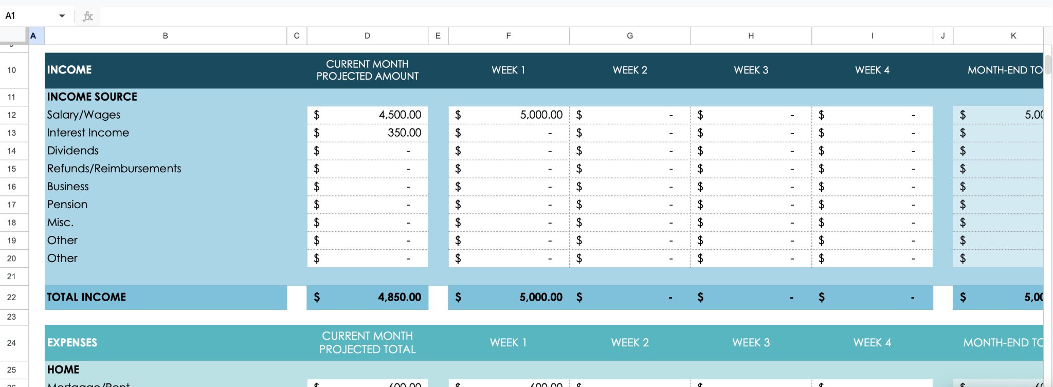
5. Bi-weekly/pay-period budget template
Best for: People paid every two weeks.
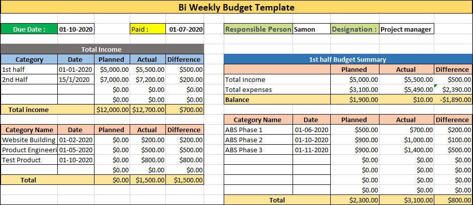
What it tracks: Income and expenses across two-week periods, current budget totals, and category-level spending.
Why it works: A bi-weekly budget template matches how many people actually receive money. Instead of forcing every bill into a calendar month, it helps you decide what each paycheck needs to cover before the next one arrives. Smartsheet’s bi-weekly template includes multiple bi-weekly date columns and expense categories such as transportation, entertainment, and health.
Limitations: It requires more setup than a monthly budget. For yearly planning, pair it with an annual budget or summary tab.
Get the template: Copy the bi-weekly budget template
6. Household/family budget template
Best for: Couples, families, roommates, and shared expenses.
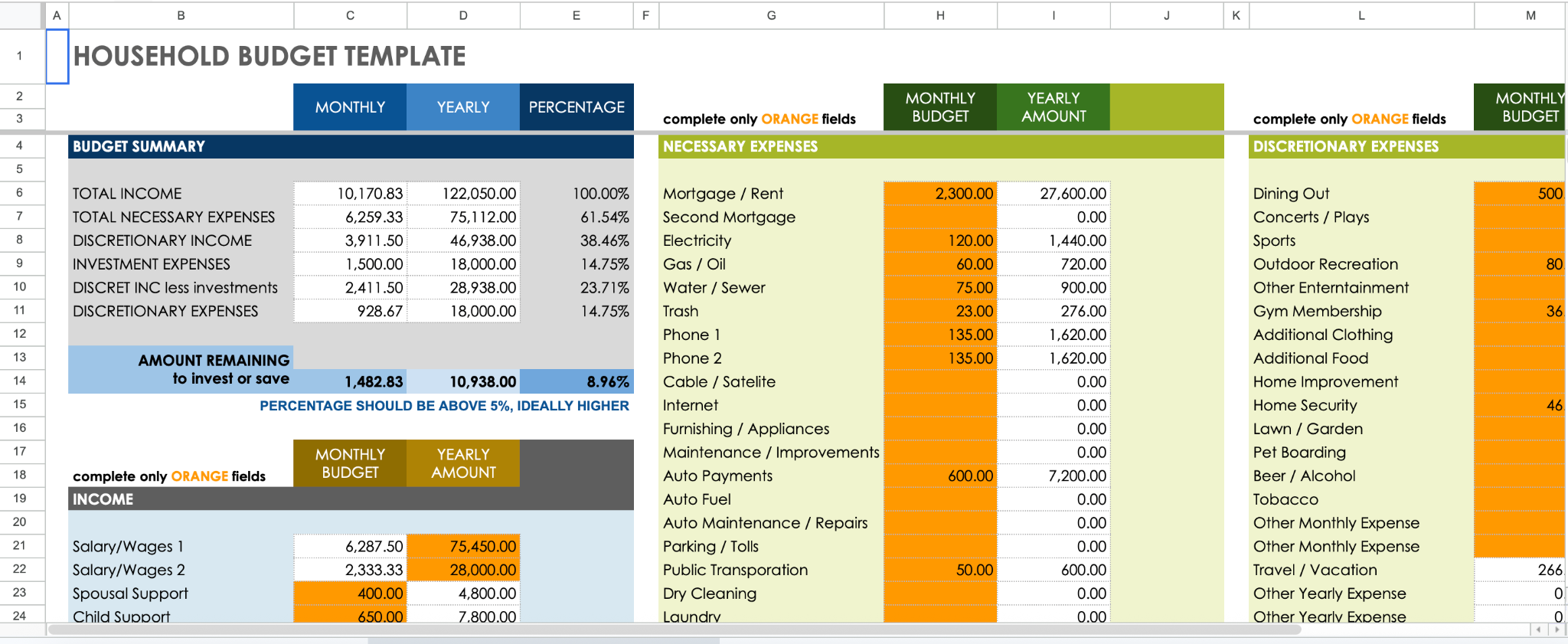
What it tracks: Household income, necessary expenses, discretionary expenses, investment expenses, monthly totals, and yearly totals.
Why it works: A household budget template gives shared expenses a clear structure. Smartsheet’s household Google Sheets template includes sections for necessary expenses, discretionary expenses, and investment expenses, plus a budget summary for monthly and yearly totals.
Limitations: Shared sheets need clear permissions. Decide who can edit categories, who can update transactions, and who should only view the dashboard.
Get the template: Copy the household budget template
7. Zero-based budget template
Best for: People who want every dollar assigned before the month starts.
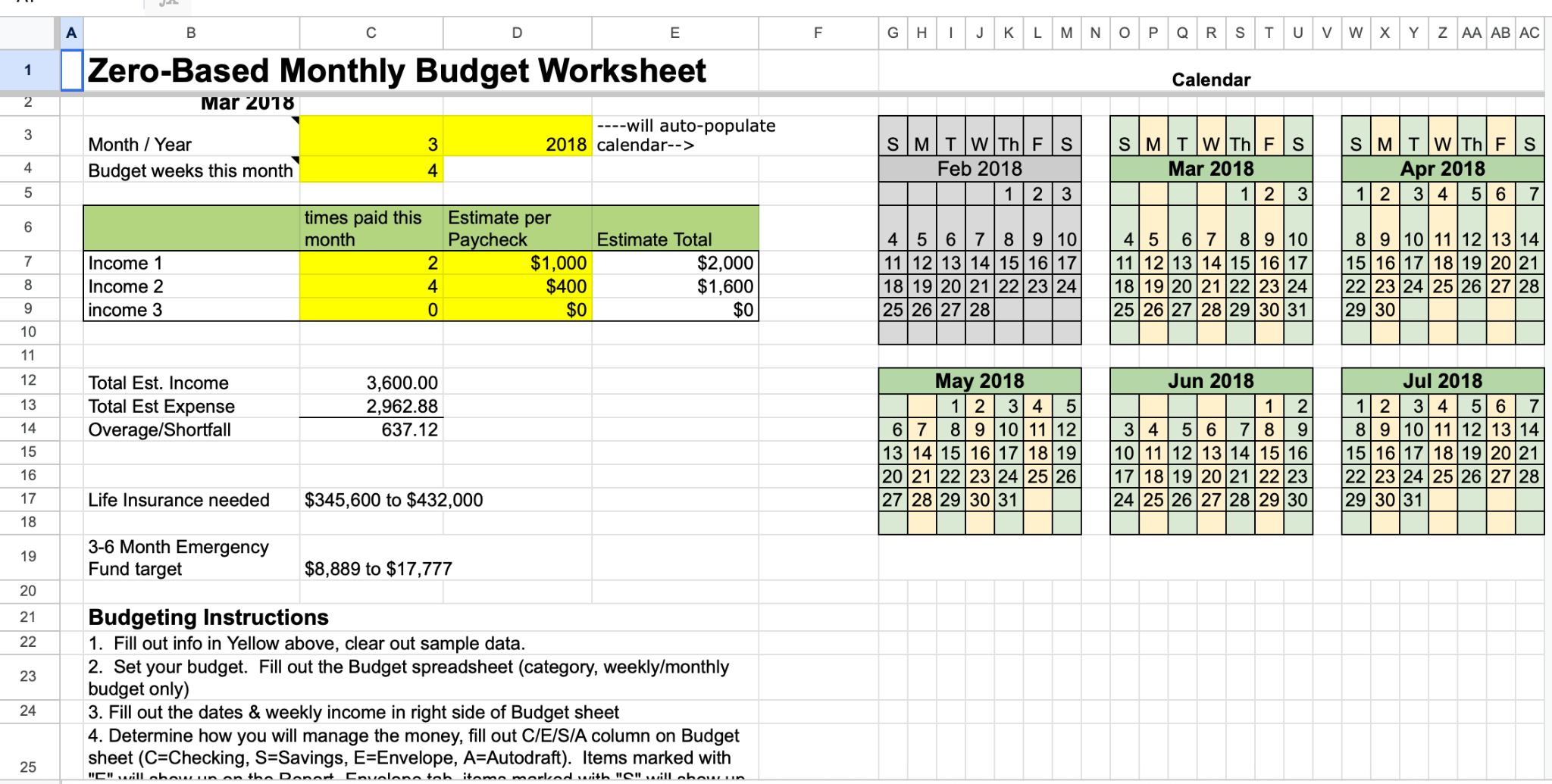
What it tracks: Income, expense categories, savings, debt payments, planned balances, and actual balances.
Why it works: A zero-based budget makes the budget balance the main goal. Smartsheet’s zero-based Google Sheets template is designed to align spending with income and includes rows that show whether planned and actual spending meet the zero-based budget goal.
Limitations: It takes more maintenance than a simple monthly template because every dollar needs a category. It is not ideal for someone who only wants a quick spending snapshot.
Get the template: Copy the zero-based budget template
8. 50/30/20 budget template
Best for: Simple category planning.
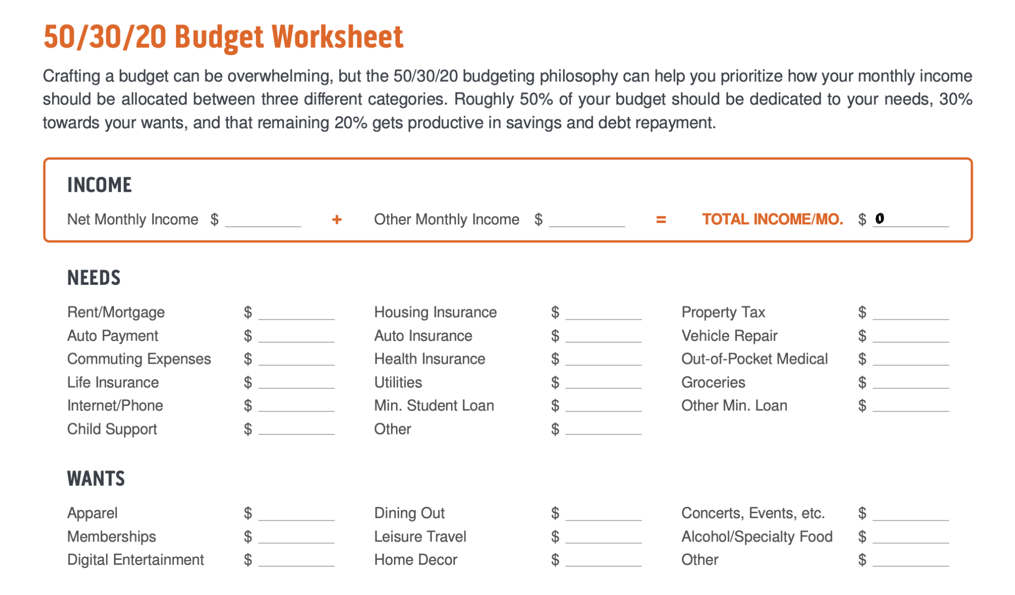
What it tracks: Needs, wants, savings, debt repayment, budgeted amounts, and actual amounts.
Why it works: The 50/30/20 method is easy to understand: split income into needs, wants, and savings or debt repayment. NerdWallet describes its own 50/30/20 spreadsheet as a way to compare monthly income and expenses against the 50%, 30%, and 20% breakdown, while Smartsheet’s Google Sheets version includes needs, wants, savings, budget, and actual columns.
Limitations: The ratios are a starting point, not a rule that works for every household. People in high-cost areas, students, families, or anyone with irregular income may need different percentages.
Get the template: Copy the 50/30/20 budget template
8. Student/college budget template
Best for: Students planning by semester or school year.
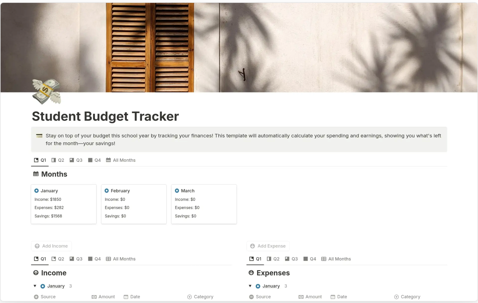
What it tracks: Semester income, school expenses, living costs, balances, and estimated college expenses.
Why it works: Student budgets are not always monthly. Tuition, books, housing, meals, and financial aid often follow semester timelines. Smartsheet’s college student Google Sheets budget template includes a four-semester summary and a college expense estimator sheet.
Limitations: It may need customization for scholarships, part-time income, shared housing, meal plans, or study-abroad costs.
Get the template: Copy the student budget template
9. Travel budget template
Best for: Vacation planning, group trips, and travel cost comparisons.
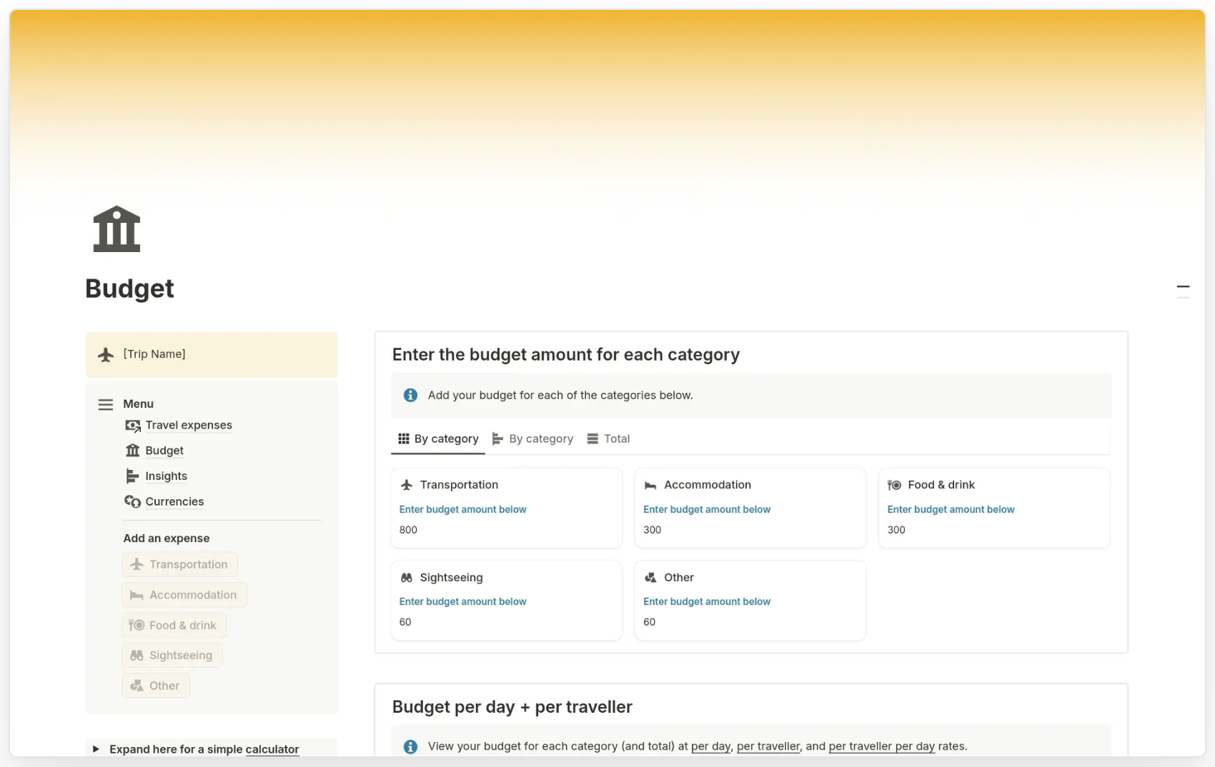
What it tracks: Flights, lodging, transportation, food, activities, actual spending, over/under budget, and cost per person.
Why it works: A travel budget template keeps trip planning separate from everyday budgeting. The linked Google Sheet includes budget, actual, over/under, and per-person columns, while the source page explains that users can make a copy and edit the sheet for their own trips.
Limitations: This is a simple trip planner, not a full personal finance system. Use it alongside your monthly or annual budget if travel is part of a larger savings plan.
Get the template: Copy the travel budget template
10. Beginner/simple budget template
Best for: Beginners who want a clean spreadsheet without too many tabs.
What it tracks: Monthly income, monthly expenses, net income, and basic category totals.
Why it works: A simple budget template removes setup friction. Smartsheet’s simple Google Sheets budget template includes total income, total expenses, net income, and a bar chart comparing income and expenses.
Limitations: It is not detailed enough for complex household planning, business budgeting, debt payoff, or transaction-level analysis.
Get the template: Copy the simple budget template
How to choose the right Google Sheets budget template
Choose the template that matches how money enters and leaves your life.
- Use a monthly budget template if you have a fixed salary, predictable bills, and a regular savings plan.
- Use a weekly budget template if small purchases are where your budget usually gets off track.
- Use a bi-weekly budget template if your paychecks arrive every two weeks and you want each paycheck to cover a specific set of bills.
- Use a zero-based budget template if you want to assign every dollar to spending, saving, debt, or giving before the month starts.
- Use a 50/30/20 budget template if you want a simple category framework instead of a detailed line-by-line system.
- Use a household budget template if more than one person contributes to shared expenses.
- Use a business budget template if you need to track revenue, operating costs, cash flow, and planned vs actual performance.
A good rule: start with the simplest template that gives you enough visibility. Add complexity only when your budget needs it.
How to customize a budget template in Google Sheets
Once you copy a budget template, update it before adding real data.
First, rename categories so they match your life or business. Common personal categories include housing, utilities, groceries, transportation, insurance, subscriptions, savings, debt payments, and entertainment. Common business categories include revenue, payroll, software, contractors, rent, marketing, taxes, procurement, reimbursements, and professional services.
Next, add dropdowns for recurring categories. This keeps entries consistent and makes charts easier to build.
Then, use conditional formatting to highlight overspending, missed savings goals, negative balances, or unusually high expenses. Google’s Gemini support page notes that Gemini in Sheets can help with actions like conditional formatting, dropdowns, formulas, pivot tables, filters, and charts, depending on plan availability.
Finally, check sharing permissions. For a personal budget, view-only access may be enough. For a household or business budget, decide who can edit transactions, who can change formulas, and who can approve changes.
Using Gemini or AI to improve a Google Sheets budget template
You do not need to turn your budget into an AI project, but Gemini can help with small spreadsheet tasks.
For example, you can ask Gemini to create formulas, build charts, summarize trends, apply formatting, create dropdowns, or generate data analysis in Google Sheets. Google’s Workspace page says Gemini in Sheets can help structure data, create formulas, format spreadsheets, build charts, and analyze information; Google also announced newer Gemini in Sheets capabilities in April 2026 for building and editing more complex spreadsheets using natural language.
Useful prompts:
- “Create a formula that shows the difference between budgeted and actual spending.”
- “Create a dropdown list for expense categories.”
- “Highlight expenses that are more than 10% over budget.”
- “Create a chart showing monthly income vs expenses.”
- “Summarize which categories increased the most this quarter.”
Always check the output before relying on it. Budget formulas affect real decisions, so review totals, cell ranges, and category labels manually.
Google Sheets budget template vs budgeting app
A Google Sheets budget template is best when you want control, customization, and a free spreadsheet you can edit yourself. NerdWallet notes that Google Sheets has pre-made monthly, annual, and business budget templates, and that Sheets can be accessed for free with a Google account.
A budgeting app is better when you want less manual entry, automatic categorization, reminders, and built-in mobile workflows. The tradeoff is that apps may involve subscriptions, account connections, bank-sync permissions, or less flexibility than a spreadsheet.
Use a Google Sheets budget template when:
- You want a free or low-cost system.
- You like editing categories yourself.
- You want to share a sheet with a partner, roommate, or team.
- You do not want to connect financial accounts.
- You want a template you can copy and archive each month or year.
Use a budgeting app when:
- You do not want to enter transactions manually.
- You want alerts, reminders, and account syncing.
- You prefer a mobile-first experience.
- You need automated categorization more than spreadsheet flexibility.
When a budget spreadsheet should become a dashboard or app
For personal budgeting, a spreadsheet is usually enough. For business budgeting, the spreadsheet can become a shared process.
If a budget spreadsheet becomes a shared business workflow, such as department budget approvals, procurement tracking, reimbursements, client budget dashboards, or internal finance reporting, UI Bakery can turn Google Sheets data into an internal app with forms, permissions, and workflow controls.
UI Bakery’s Google Sheets integration lets teams build internal tools directly from sheet data, and the UI Bakery docs show that Google Sheets can be connected as a data source with read-only or read-write permissions. UI Bakery also offers a Google Sheets Dashboard template for connecting live Google Sheets data, tracking KPIs, and exploring financial or business metrics.
Does Google Sheets have a budget template?
Yes. Google Sheets has pre-made budget templates, including monthly and annual budget templates. NerdWallet notes that users can browse the Google Sheets template gallery and start with the “Monthly budget” template.
What is the best free Google Sheets budget template?
The best free Google Sheets budget template depends on your budgeting style. Use a monthly template for regular planning, a weekly or bi-weekly template for variable income, a zero-based template for assigning every dollar, a 50/30/20 template for simple category planning, and a business budget template for revenue and expense tracking.
How do I make a monthly budget in Google Sheets?
Copy a monthly budget template, enter your income, list your fixed and variable expenses, add savings categories, and compare planned vs actual spending. A good monthly budget sheet should show income, expenses, savings, and net income in one summary view.
Is Google Sheets better than Excel for budgeting?
Google Sheets is often better for shared or cloud-based budgeting because it is easy to access through a browser and share with another person. Excel can be better for advanced spreadsheet users, offline work, or complex financial modeling. For most simple personal budgets, either tool works.
Can I share a Google Sheets budget with my partner?
Yes. You can share a Google Sheets budget with a partner, family member, roommate, or team. Use view-only access if they only need to review the budget, and edit access if they need to add expenses or update categories.
What is the easiest budget template for beginners?
The easiest budget template for beginners is a simple monthly budget template. It should include income, expenses, savings, and net income without too many tabs or advanced formulas. Once that feels comfortable, you can move to a weekly, zero-based, 50/30/20, or transaction-tracking template.


"The UI Bakery platform offers a cost-effective approach to creating applications. With UI Bakery, you can achieve your app development goals without breaking the bank."

"Before switching to UI Bakery we developed a number of apps within the Retool system. The Retool system was good but ultimately did not have the flexibility and feature sets that we required."
Check the Story