2024 UX/UI design trends you should know about
With the recent growth of technology, the design world’s greatly changed, and it still continues to evolve. Complex, unique, and well-considered approaches to the interfaces creation occur. It’s important to look ahead, be able to predict what design will be like tomorrow, and experiment with new ideas to move the industry forward.
It’s May already, the peak of 2024. High time to check the juiciest and most inspiring UX/UI design directions!
UI design
Illustrations
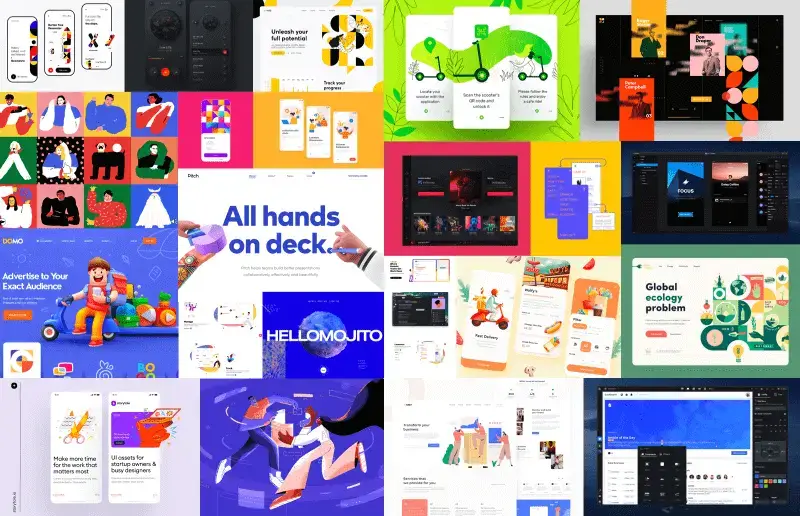
It’s still the winner among UI trends. A hand-drawing style is the most popular now. Have you heard about Procreate and Apple Pencils? I believe yes. Procreate allows for creating recognizable illustrations with different geometric patterns, noise-effect and deliberate careless effect much faster, and the content created in this way is especially trendy for storytelling and onboardings.

Animations and motion design
Without any doubt, motion design and stylish animations are the most expensive and the hardest to create, while also the most visually pleasing kind of content. If you want to ship onboarding clips faster (without a full production setup), the Renderforest AI video generator can help you turn a script into a ready-to-use video you can embed across key pages. For now, more and more websites’ creators choose videos as the main visual content on their pages, and onboarding lessons are transformed into interactive video tutorials. The illustrative examples of how your product works or brand’s character story is the best way to show users the values of your creation. Animations and videos always keep users’ attention, and increase their trust towards your service or product. So this year, animations of all kinds will still be trending.
Creative scrolls
It’s not brand new, but the popularity of creative scrolls has significantly increased. Their use is gradually becoming something that goes without saying in the development and design of web and mobile apps.
Retro
Retro style has had a strong impact on the art world including movies, music, graphic design, etc. Well, UI design is not an exception.
Bold colors
It seems that bold colors may soon lose their popularity, since muted colors are gaining attention. Nevertheless, high saturation color scheme palettes are still widely used.
Nothing more to add – just use colors at their full power!

Creative custom fonts
This is a particularly strong direction in web design. Designers have put regular fonts aside. Open Sans, Lato, Roboto fonts are good for applications where designers need to ensure the best accessibility on any screen of any device. However, when it comes to creating websites, it’s better to use more brazen and unusual fonts there. Moreover, fonts are still used as a background image, and as the main element of the page.

Graphic patterns in the Bauhaus style
This one is a particularly strong direction in web design now. A lot of creators have turned to the Bauhaus design style. Its distinctive features are straight and plain lines, strict geometric shapes, and no distracting and non-functional details. Graphic patterns can be combined with photos, modern graphics and illustrations, or be a stand-alone part of the design.

Dark mode
It’s becoming a classic this year. Moreover, using the dark mode is a kind of unspoken rule in web and mobile applications design. What benefits do users find ‘on the dark side’? The most important one is the reduced eye strain and lower battery consumption for mobile devices and tablets.
And what side do you choose?

3D depth
Users seem to be tired of traditional flat images that have been overused for so many years. 3D graphics has come as an alternative. It can be both static and dynamic. Last year, abstractions and geometric compositions were the most popular, while this year cartoons and realism joined the ranks. To be on top, combine all these microtrends in one!
Audacious & confusing website style
Take a look at Figma and Tubik Crew websites. Simple and straightforward forms, bold colors, the combinations of rough and simple shapes with tiny lines in illustrations – here are several microtrends that have formed one big trend for the audacious design. Currently, it’s gaining momentum, especially in product design and branding.

Neumorphism
Many years ago, when the first iPhones and small screens allowing for more spectacular coloring appeared, skeuomorphism was trendy. The tendency to simulate real life in design became outdated, and “flat” design came into power. Later, it was influenced by the Material Design System. In the result, the circle has been closed, and we’ve got the modern version of Skeuomorphism – Neomorphism. It implies the combination of the flat design with real-life things like texture, depth, and shadows. This trend is not brand new, nevertheless, it gained recognition not so long ago. Also, thanks to this trend, it will soon become popular to use a brevity, elegant, and ultra-technical style in design with very few color accents.

UX design
Microiterations
It is one of the best methods to improve user experience. Microiterations help to make the user’s interaction with the system much easier and smoother. I believe this trend is a long-lasting one, since now there’s hardly any good system that goes without microiterations.
Augmented reality and virtual reality
Over the last several years technologies have become faster and more affordable. Day-to-day, physical and virtual realities are getting closer and closer to each other. That is why we’re gradually moving away from traditional technologies, and turning to AR & VR. The design sphere has also given in to this trend, and UX/UI designers have appreciated this tendency, and take advantage of this approach in their work now.
Voice-based technology
Edison Research and Triton Digital released their annual Infinite Dial survey, according to which more than 62% of respondents use a voice-based virtual assistant, mostly – via phone or computer. Another research published by Statista defined that more than 50% of respondents use a voice-user interface (VUI). So this technology has already entered our life, and is getting more and more pervasive.
Onboardings and tutorials
Your application or product might be too complex, have weak UX design, or poor UI design. All these things can push away your users during their first experience with your system, even if they know that your product can solve all their pains. The first impression really matters, so there’s a high probability that your product won’t get a second chance from the disappointed users.
Not to let your users down, pay due attention to creating proper tutorials and onboardings. The number of companies preparing comprehensive onboardings to make users’ introduction to their product smooth and pleasant is constantly growing. Onboardings do not look like modal windows with boring texts anymore. They are fully interactive now, and are sometimes made as a game: designers prepare illustrations for onboardings, wrap them into storytellings (another bright trend in UX design at the moment), and just do everything to make users exclaim “Wow!”, and fall in love with your product and brand.

Storytelling
This trend is about how to emotionally tie users to the product with a story. Stories usually have particular characters. Just like illustrations, animations, and some other extremely popular trends, storytelling draws user’s attention to the message transferred through the app, and makes them immediately fall for your brand.

Design process trends
We’ve talked a lot about the tendencies in UI and UX design. But what about the trends in the design process in particular? Design modernization results in the evolution of the designer’s workflow that leads to the occurrence of the new approaches and new tools.
Let's define the most impressive ones.
Design Systems
This trend is about the discipline in the design world, and it’s not new. Material Design System, for example, has been available for free for many years. However, every product owner wants to apply their own design principles, and have a recognizable and unique appearance. So there’s no surprise that Design Systems have sparked interest.
But what do all designers, developers, and the companies they work in find in Design Systems? Businesses always strive to optimize work processes, speed them up, simplify, and make them more efficient. That is exactly what Design Systems can help to achieve. What’s more, they allow for increasing product value, improving user experience, getting clean code, and ensuring design consistency.
Nevertheless, building a Design System is not cheap. That’s why there’s a variety of libraries like Eva Design System and Shift that allow for preparing white-label Design Systems. These libraries are attracting more and more interest, and can be customized to match any brand, and meet any customer’s needs.

No-code approach
UX/UI designers want more freedom of creativity, the ability to make changes faster following trends, their own vision, and users’ needs. What is also important, they need to have more independence from developers. To achieve all this, UX/UI designers choose no-code app builders to create & design apps (Draftbit, UI Bakery, Mendix) and websites (SquareSpace, Wix, Webflow). These visual development tools allow designers to make the front-end (and not only front-end) part of work without developers’ involvement. In the modern world, when people want to see the results in the shortest possible term, this advantage is extremely valuable.

Collaboration & teamwork
There has always been a stereotype that designers are "lone rangers”. Now, a trend for collaboration is spreading not only in the design community. Modern designers should be not only good creators but also communicative, friendly, and supportive team members. Meanwhile, small and medium businesses are starting to realize the importance of the design & designers in a company, so companies hire new employees to expand their design teams. Due to this, the issues with files, their versions, and the division of tasks across several designers occur.
Yes, collaboration is hard, but the industry is trying to make it easier by ensuring the ability for several designers to work simultaneously on one project. This is called a real-time collaboration. Figma was one of the first design products that added this functionality to their design tool.

Cloud
Storing files on a computer is becoming a thing of the past. Now, design files are mostly stored in the cloud where there is such new functionality like an inspector, a resource storage system, collaboration functionality. Thus, the entire team has constant access to any corporation files. The possibility of losing the info on any project is minimized, and designers are given the opportunity to work together and share their ideas with colleagues.

Version control
Remember times when we stored files named: “Last version1”, “Last version123”, “Last version1234”… OMG, luckily, we do not have to follow this file naming method when working in Photoshop with UX/UI design now! The world is developing, systems are becoming more complex, and it’s important to make sure that every design file is in the right place. Almost all design apps (Figma, Sketch, InvisionStudio, and others) have updated their systems, and added version control. Also, there are some tools analogous to Github but for designers, e.g., Abstract. It has the possibility to create commits, branches, prepare libraries, and share them between the projects.

What to avoid in design in 2020
Mixed typography
Many years ago there was a big trend for ultra-detailed typography. Calligraphic and infographic styles existed not only in printed matter but were also used in web design, often combined with the design using old newspapers and posters. It was so popular that every stock service for designers was flooded with these visuals. Many of them looked, to put it mildly bad, as if it was terribly difficult for someone to work with fonts.
Modern designers prefer much more understandable and easy-to-perceive alternatives – large-scale, impact fonts, and no more than 1-2 styles used at the same time. Anyway, custom fonts are in trend now, and standard font styles like Arial, Open Sans, and Lato are going out of fashion.
Static
Wherever you use static things (websites, applications, social networks), it is a relic of the past already. Modern users want to see dynamic pictures on the websites, enjoy catchy content in the applications, and read non-trivial social network posts. All these users’ wishes can be satisfied by using motion content, not static.
Traditional stock imagery
The value of stock visuals is getting lower every day, and it’s not a surprise. Custom images raise the value of designers’ work, and custom designs look much more unique and expensive. Designers have a lot of modern technologies today to simplify and automate their routine tasks, and save time for more important, creative, and exciting work.
On a final note
It cannot be said that there are so many new trends this year. However, I want to emphasise that the design sphere expands, and its borders are getting more and more blurry. UX/UI design is becoming unique, and UX/UI designers are working in a freedom of creativity.
With a powerful Design System under the hood, the UI Bakery internal tool builder can meet all your key web app development and design needs. Find out – pop in the platform to taste all its basic and advanced development and design features.


