5 Top UI Component Libraries for React in 2026

Updated:
March 12, 2025
For the modern developer, efficiency isn't just a buzzword – it's a survival skill. We've all been there: staring at a blank create-react-app, wondering how to avoid reinventing the wheel. That's where robust UI component libraries come in. But with a sea of options, which ones truly deliver? We're diving deep into five killer React component libraries, plus a tool that can drastically accelerate your workflow.
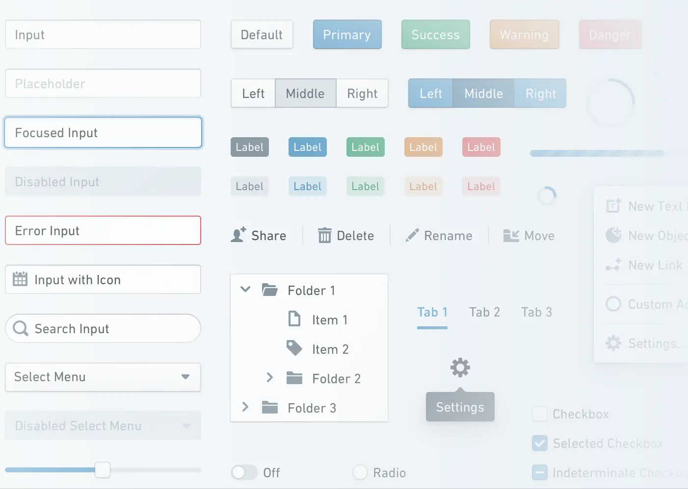
MUI (Material-UI)
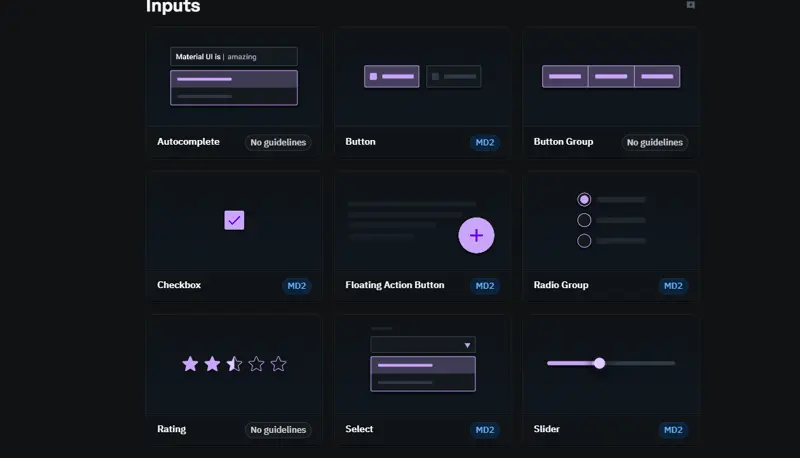
Still rocking in 2026, MUI (formerly Material-UI) is basically a must-know in the React ecosystem. It’s got that Material Design vibe, but it’s evolved into something way more flexible and customizable. This library is stacked with a massive collection of components and themes, ready to drop into your app.
Key features:
- Comprehensive component library: Includes buttons, inputs, dialogs, tables, and more. MUI’s extensive range makes it a go-to for developers needing to implement a wide variety of UI elements.
- Customizability: Provides a powerful theme customization API, allowing developers to modify base styles, colors, typography, and more.
- Performance: Lightweight and efficient, making it a solid choice for both small-scale apps and enterprise-level solutions.
- React native support: While MUI is primarily a React UI component library, its cousin library, Material UI for React Native, extends this power to mobile apps.
Why use it:
You want a reliable, feature-rich, and fully customizable UI library for React that nails the Material Design aesthetic without cramping your style. Ideal for both small teams and enterprise-level builds.
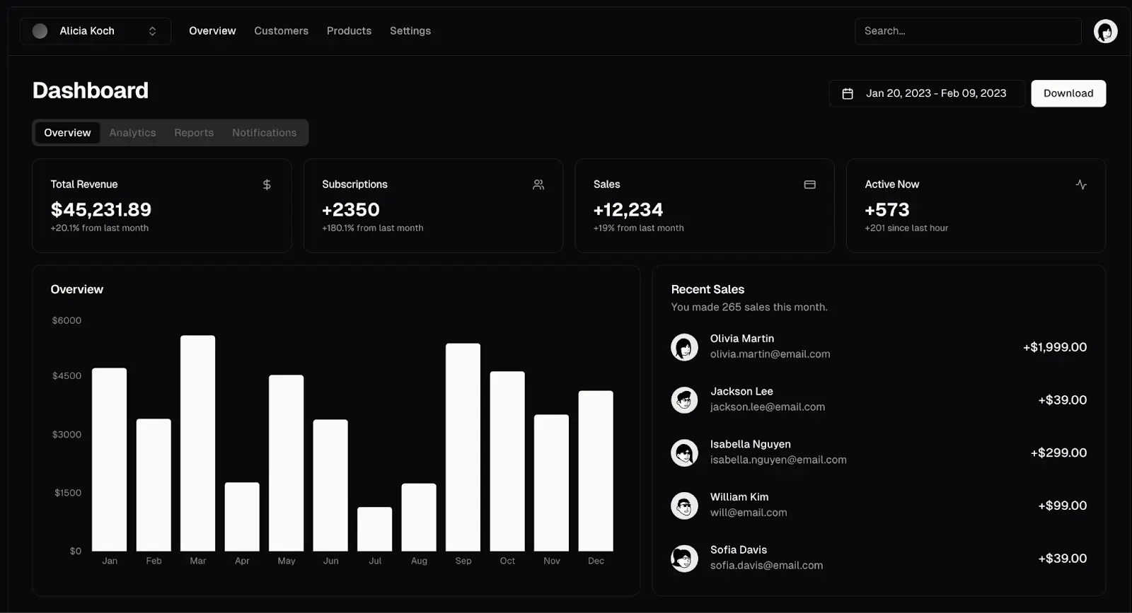
Ant Design
If you’ve worked on enterprise apps, you’ve probably already bumped into Ant Design. Built by the Alibaba gang, Ant Design is a beast when it comes to crafting complex, data-heavy applications. It's like the Swiss Army knife of React component libraries, offering every UI element under the sun.
Key features:
- Rich set of components: Ant Design offers a huge array of polished UI components ranging from simple buttons and inputs to complex components like date pickers, charts, and timelines.
- Design language: Built with a powerful design system that ensures consistency and structure throughout the app, adhering to Ant Design’s UX/UI guidelines.
- Built-in internationalization (i18n): Supports multiple languages out-of-the-box, making it a great choice for applications targeting global audiences.
- Theming: Supports dynamic theme switching with dark/light modes, offering high customizability without breaking the user experience.
Why use it?
Ant Design is the best React UI library for developers working on complex, data-driven applications. Its modularity, design system, and powerful documentation make it a top choice for enterprise teams looking to scale efficiently.
Chakra UI
Chakra UI is all about keeping things simple and developer-friendly. It’s a rising star in the React UI component libraries space, known for its minimalism and accessibility. If you’re all about rapid development and making sure your app is easy to use for everyone, Chakra’s got your back.
Key features:
- Simplicity and ease of use: Chakra’s API is clean and intuitive. Components are composable, allowing developers to quickly build UIs with minimal code.
- Accessibility: Chakra UI ensures that all its components meet WCAG 2.1 standards, making it an excellent choice for developers focused on building inclusive applications.
- Responsive styles: Out-of-the-box support for responsive design. Chakra’s layout components automatically adjust for various screen sizes.
- Theming: Chakra allows developers to define theme tokens, customizing colors, fonts, and spacing values across the entire app.
Why use it?
Chakra UI is ideal for teams that want a simple, flexible, and accessible React UI library that doesn’t compromise on design. It’s perfect for projects where speed-to-market is a priority, yet high-quality UI is essential.
Blueprint
Created by Palantir, Blueprint is a go-to for anyone building complex, data-driven apps – think dashboards, analytics, financial tools, or scientific apps. It’s geared towards desktop UIs, and while other libraries are all about mobile-first, Blueprint is built with desktop-first in mind.
Key features:
- Data-centric components: Offers components like tables, forms, date pickers, timezones, and even complex charting components.
- Customizability: Provides a vast degree of control over styling and theming while maintaining high performance and efficiency.
- Focused on desktop UIs: Unlike some libraries that are focused on mobile-first design, Blueprint is optimized for desktop applications, which is ideal for complex dashboards or admin panels.
- Advanced documentation: Comes with detailed documentation and examples, making it easier to implement for developers working on high-stakes, large-scale applications.
Why use it?
Blueprint is the best UI library for React when building heavy, data-driven desktop applications. It’s specifically designed to handle large datasets and complex UIs while offering a slick and professional look.
Shadcn/UI
Shadcn/UI is relatively new on the block but already making waves for its modular approach and ultra-flexible components. This is the React component library you turn to when you want complete control over your UI and don’t want to be boxed in by someone else’s design constraints.
Key features:
- Highly customizable: Unlike some libraries that enforce strict design rules, Shadcn/UI provides more flexibility, making it easy for developers to customize components to fit their unique design requirements.
- Developer experience: Shadcn/UI focuses on providing a fast, minimalistic API that doesn’t clutter your codebase with unnecessary bloat.
- Aesthetic components: Each component is designed with modern, sleek visuals, ensuring that apps built with Shadcn/UI look professional and up-to-date.
- Integration with React and Tailwind: Works seamlessly with Tailwind CSS, offering a powerful combination for custom design.
Why use it?
Shadcn/UI is great for developers who want more design freedom without the restrictions imposed by heavier libraries. If you’re building a React Native UI library or want to customize your app’s design at a granular level, Shadcn/UI is a top contender.
Bonus Mention: UI Bakery
For developers looking to rapidly prototype or build production-ready web apps with minimal effort, UI Bakery offers a unique visual development platform. Though not a traditional React UI component library, UI Bakery allows you to create full-fledged React applications with a focus on low-code and drag-and-drop features. It integrates seamlessly with various React libraries and even allows importing of custom components.
Whether you're a non-technical user or an experienced developer looking to speed up the development process, UI Bakery is a powerful tool to consider for building React apps faster without sacrificing quality.
Wrapping up
In 2026, there’s no shortage of awesome React UI libraries to choose from. Whether you’re looking for enterprise-level tools like Ant Design, want to keep it simple with Chakra UI, or need data-driven powerhouses like Blueprint, there’s something for every kind of app. And if you want to speed things up with a low-code tool, UI Bakery is your ace up the sleeve.
So, whatever you’re building, these top React component libraries have you covered. Happy coding!


"The UI Bakery platform offers a cost-effective approach to creating applications. With UI Bakery, you can achieve your app development goals without breaking the bank."

"Before switching to UI Bakery we developed a number of apps within the Retool system. The Retool system was good but ultimately did not have the flexibility and feature sets that we required."
Check the Story